

USPAS Inc
Redesign of a local paralegal’s website to develop the website’s brand
Roles
UX/UI Designer
Researcher
Tools
Scope
Photoshop
Figma
End to end design
Timeline
4 weeks

How the journey started
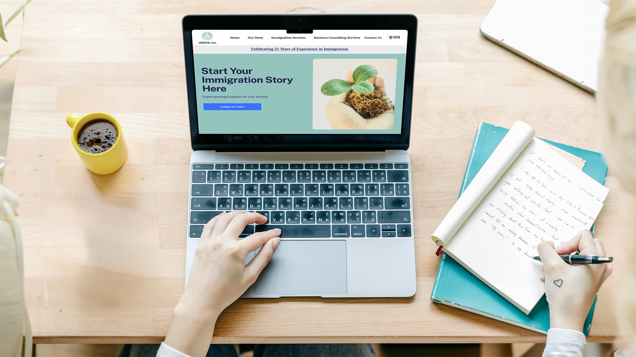
I reached out to a local paralegal business whose website looked like it could use some TLC. We collaborated to redesign their website, while keeping their brand identity intact. During my initial talk with them, I determined what they hoped to achieve through updating their site UX.
Business Goals

Re-Organize Information
Categorize information in a logical way, and ensure straightforward navigation to ease site maintainenance in the future.

Build Reputation with Customers
Have a site that has an air of legitimacy to help them build trust with customers, and have an easy way for customers to leave feedback
01.
Research
I interviewed 4 people about their experiences with paralegal immigration sites to better understand the information they need to decide which business to use. I looked at other local paralegal businesses and focused on site organization and how they built their reputations.
Current Customer Journey

Searches for a paralegal to help with a business or immigration problem

Selects a website they think is trustworthy and reliable.

Tries to determine if the business provides the needed services

Unsure if they want to use the business or invest any more time in trying to find the info they need.
Industry Insights
Other local paralegal websites offer a wide range of services, and clearly highlight their partnerships with other local businesses. However, the amount of information and the way it’s organized result in information overload. Additionally, they are not accessible for those with vision problems (low contrast text with irregular spacing).
0.2
How might we make a paralegal site trustworthy and easy to understand?

Information sorted into clearly delineated categories.
Independent ratings and endorsements

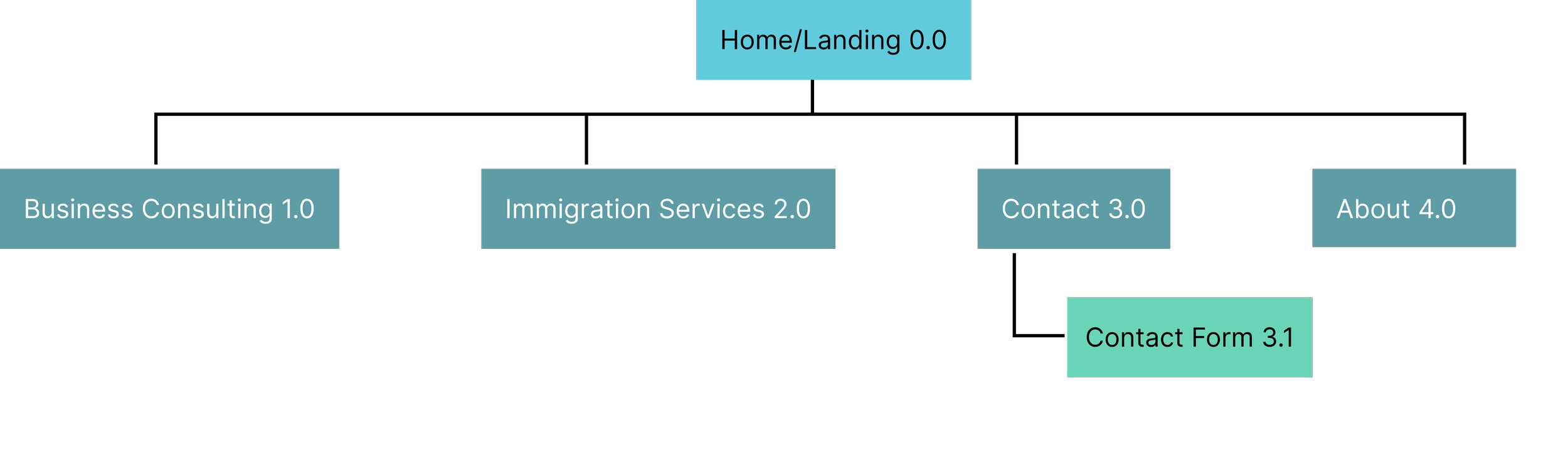
Limiting the site’s navigation depth
Content Strategy
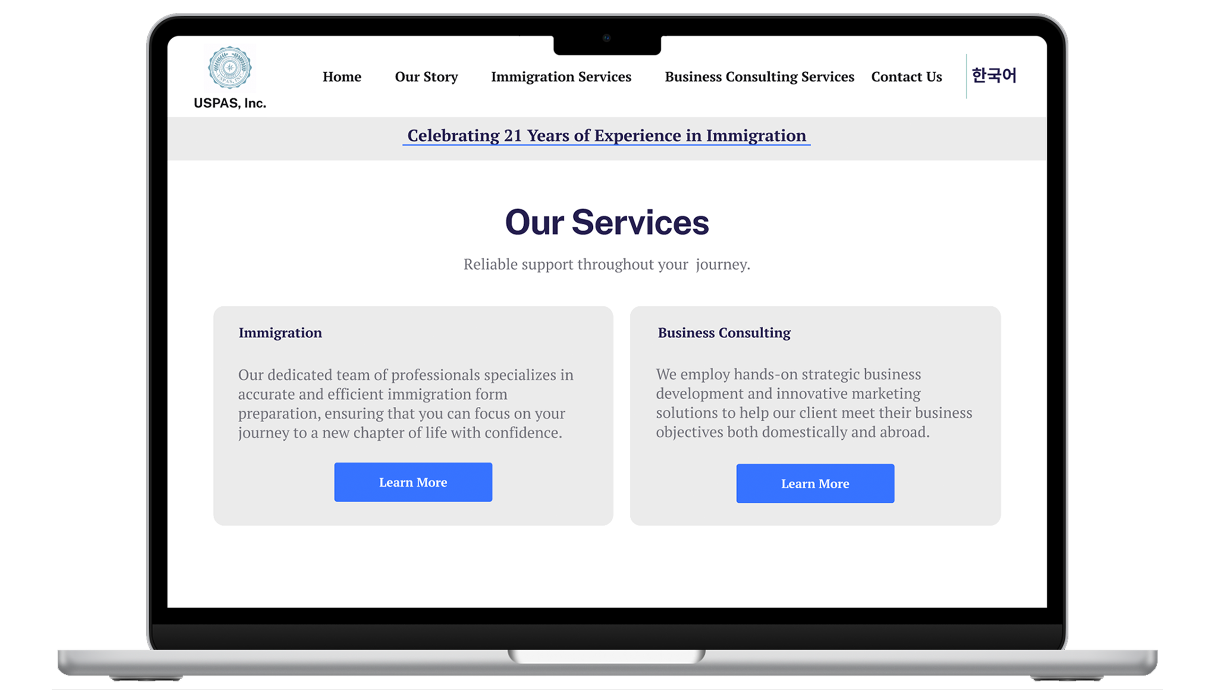
A major part of my work with USPAS was ensuring that the content on their site was digestible and relevant to users. During my informational interviews with USPAS, I determined which services they offered, and what direction the business was going in— immigration paralegal aid — to decide which service to highlight the most.
0.3
Building on the Site’s Foundation
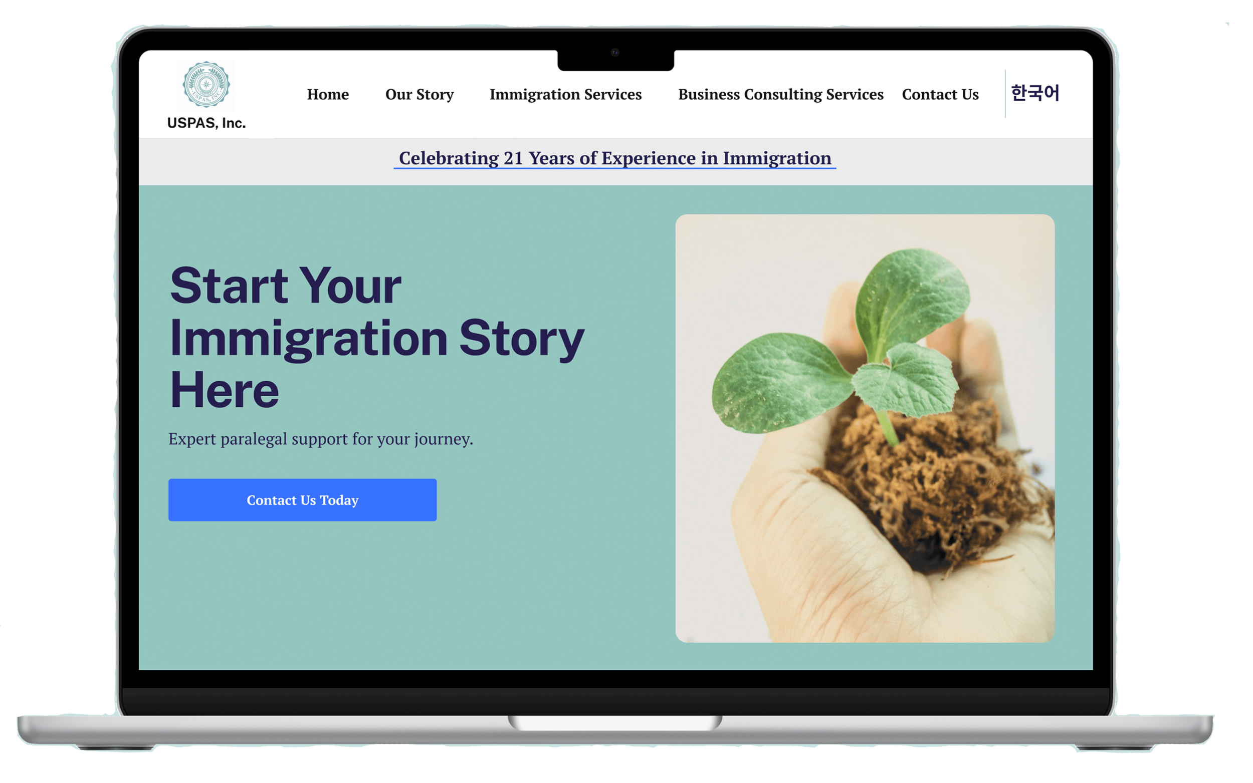
The business owner requested that I keep the design organic and minimalist. To that end, I focused on integrating visual cues to help improve understanding and help users find the information they are looking for. I also kept the site navigation shallow to limit how long it takes to explore the whole site.
Process Graphic

Users struggled with understanding what the business’s process was for each service offered, so I decided to create a description and visual aid about the process for USPAS’s services. I made the graphic for each service consistent for ease of user learning.
Transparency through spotlighted information

I noticed that many negative reviews about other paralegal companies resulted from unfulfilled expectations about each party’s roles and responsibilities. To avoid this, I created information spotlights for the responsibilities of customers and of USPAS as they pertain to each service USPAS provides.
A Final Look
Key Moments
After creating implementing the feedback I received from the usability tests, I rearranged the some of the information and included more visual cues.
Accessible Information
There are multiple pathways to access essential information about their services. More detailed, concrete info about roles and responsibilities is available by expanding certain sections.
Transparent Background
The “About” section details all of the business’s experience and the CEO’s education. Each section is denoted with an icon to increase understanding.
Easy Communication
The website includes a straightforward contact form. There’s a drop down menu for the subject, to help the business categorize the messages more easily, and allow users to get in touch with the business without having to leave the site to access their emails. This was a high priority, since positive business-client interactions are key to expanding their client base.
0.4
Reflection
I learned a lot from this project. This was my first time collaborating with a stakeholder to create a site that fulfills their needs. The most important lesson I learned was that constant communication is essential to the design process, especially when technical information needs to be communicated.